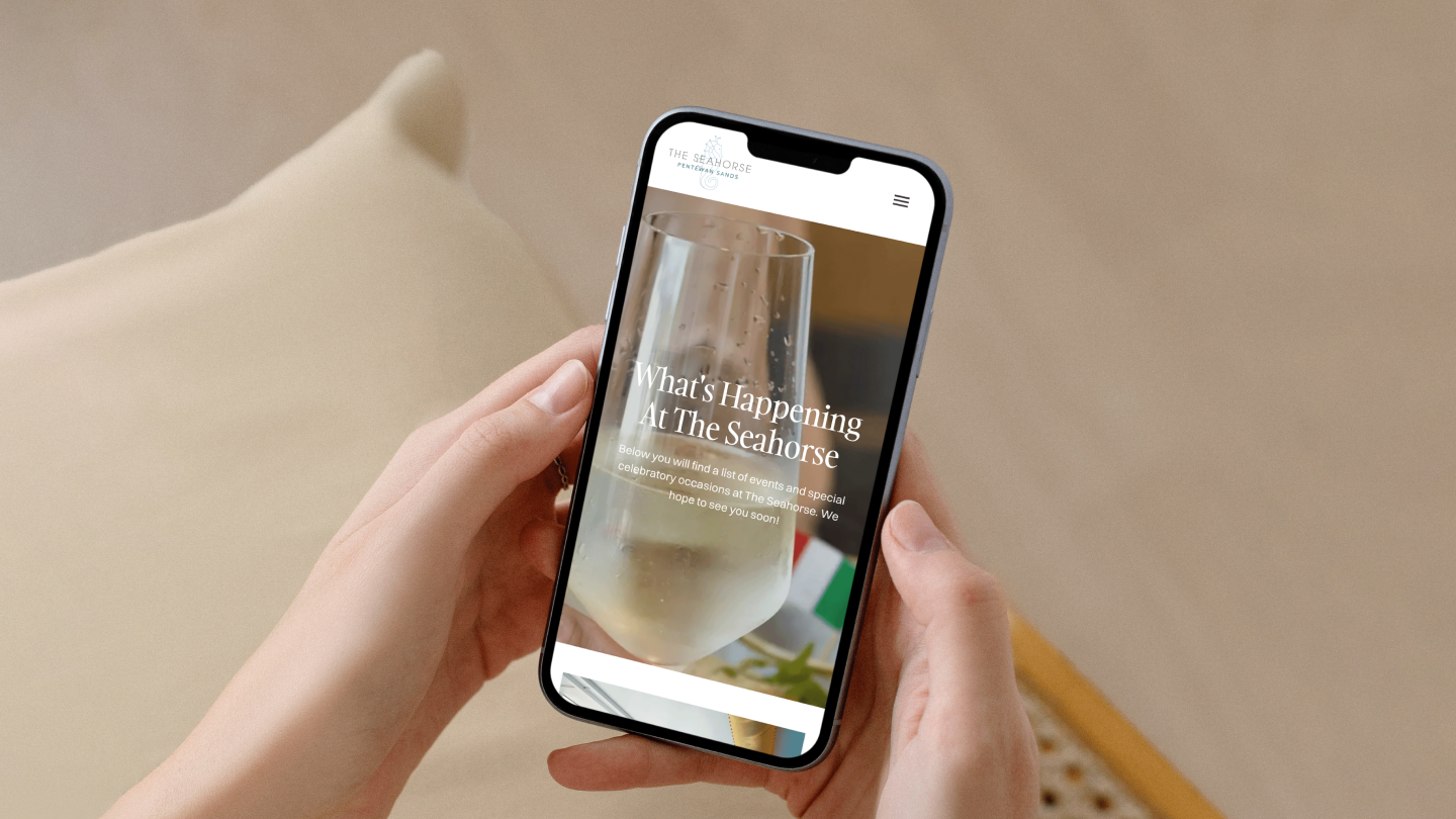
The Seahorse
The jewel in the crown of Pentewan Sands
Website redesign
Website re-platform
The Seahorse is a beautifully designed facility at Pentewan Sands Holiday Park, housing an indoor swimming pool, cafe, restaurant and bar with a large rooftop terrace.
It has amazing views from the upper floor across the park and the sea into the bay beyond. The food is high quality, using as many local ingredients as possible, and it is open to the public.
Our challenge?
The goal was to drive footfall, specifically to the restaurant and terrace. We set out to make The Seahorse the jewel in the crown of Pentewan Sands, helping push people who are on the fence about booking at Pentewan Sands over the edge, and encourage locals to make use of the facilities more regularly.
Eat. Swim. Relax.
We created a new website design that evolved the existing logo far beyond it’s realm: developing a full visual identity that speaks volumes about the passion and care that the business has put into creating The Seahorse. From a practical perspective, our solution makes the key information about what The Seahorse is, what you can do there and who it is for, instantly clear and easy to digest.
We tied together an in depth understanding of the clients challenges and ambitions with an empathy for the needs of their customers and drew upon their unique Sense of Place to craft a design solution that was really going to add value to both the business and the user experience.
In peak season Pentewan Sands is full and The Seahorse will predominantly be occupied by guests but there are also local residents who don’t really know The Seahorse exists, let alone how great the facilities are and that they are available to them.
We needed to help The Seahorse do a better job of selling itself: how special the views are from the upper floor, the high quality of the building and the food and drink.
Our design vastly extends their logo into a visual identity, taking them to a new dimension. Design elements were inspired by their unique sense of place, embodying the high quality experience open to visitors at The Seahorse.
Avoiding ‘Blanding’
'Blanding', a term coined to describe the homogenisation of brands online, is a significant challenge faced by many in the digital landscape. It occurs when brands inadvertently dilute their identity by adopting generic design templates and failing to differentiate themselves from competitors.
This could have been an easy trap to fall into for The Seahorse, which we successfully avoided with our approach to designing for the web in a modular fashion.
There are many benefits of a carefully considered approach to modular design. By deconstructing a website's layout and content into smaller, reusable components or modules, we create a modular design system that ensures they are both independent and cohesive elements. This means they can be effortlessly combined and rearranged to form a variety of page layouts and functions, offering unparalleled flexibility and adaptability.
Read more about our approach to modular web design.
“We love what Gendall have created! We had a nice logo before, but the new website design has really elevated The Seahorse brand to reflect the quality and passion we pour into every part of the experience. And it’s so flexible and easy to use I actually look forward to making updates to the site now.”
Lily Egbers, Marketing Manager
“The execution of Sanity CMS combined with a Netlify frontend gives the client the latest features such as a live editing preview and an intuitive interface which speeds up their content updates immensely. It also sets them up for growth as we are able to simplify the integration of other data sources - such as a booking engine - with little effort and no disruption to users.”
Ed Wilson, Development Lead


